Make a Pie Chart in Seconds
Turn your data into beautiful pie chart graphs instantly - no design skills needed
Our intuitive pie chart graph maker transforms your numbers into professional visualizations.
Simply describe your data in plain English, and watch as AI creates stunning pie charts with accurate percentages and eye-catching designs.
Perfect for presentations, reports, and data analysis.
Make a pie chart from your data in seconds
Make Your Pie Chart
Beautiful Pie Chart Graphs Made with Our Maker
These examples show the power of transforming text data into beautiful pie charts.
Cost Structure
Our spending this quarter looks like this: employee salaries and benefits hit 4.5 million, since talent is everything; R&D investment of 2.5 million for new products; marketing and promotion 1.8 million, customer acquisition costs are really getting expensive; office rent and utilities 800k; legal consulting and other expenses 400k. Labor costs are definitely the biggest chunk, but you gotta spend money to keep good people.

Consumer Profile
Looking at our user age distribution, it's pretty interesting. The 25-35 age group has 2000 people, most active since they're in their career prime and willing to spend; 36-45 year-olds with 1500 people are more rational and focus on quality; 18-24 year-olds have 1000 people, budget-conscious but very engaged; 46-55 year-olds with 400 people are quite stable; 56+ users with 100 people mostly come through friend referrals.
User Satisfaction Survey
The results from 1000 surveys are pretty good actually. 420 people very satisfied, so our efforts paid off; 350 people fairly satisfied, overall OK but with minor issues; 150 people neutral, maybe we haven't quite hit their sweet spot; 60 people somewhat dissatisfied, mainly complaining we're too slow to respond; 20 people very dissatisfied, ran into technical problems and our customer service didn't keep up.
How to Make a Pie Chart in 4 Easy Steps
Creating professional pie charts has never been easier. Our pie chart graph maker guides you through a simple process that takes just minutes, no matter your skill level.
Tell Us About Your Data
Simply describe your information in plain English - like 'Sales by region: North 40%, South 30%, East 20%, West 10%'
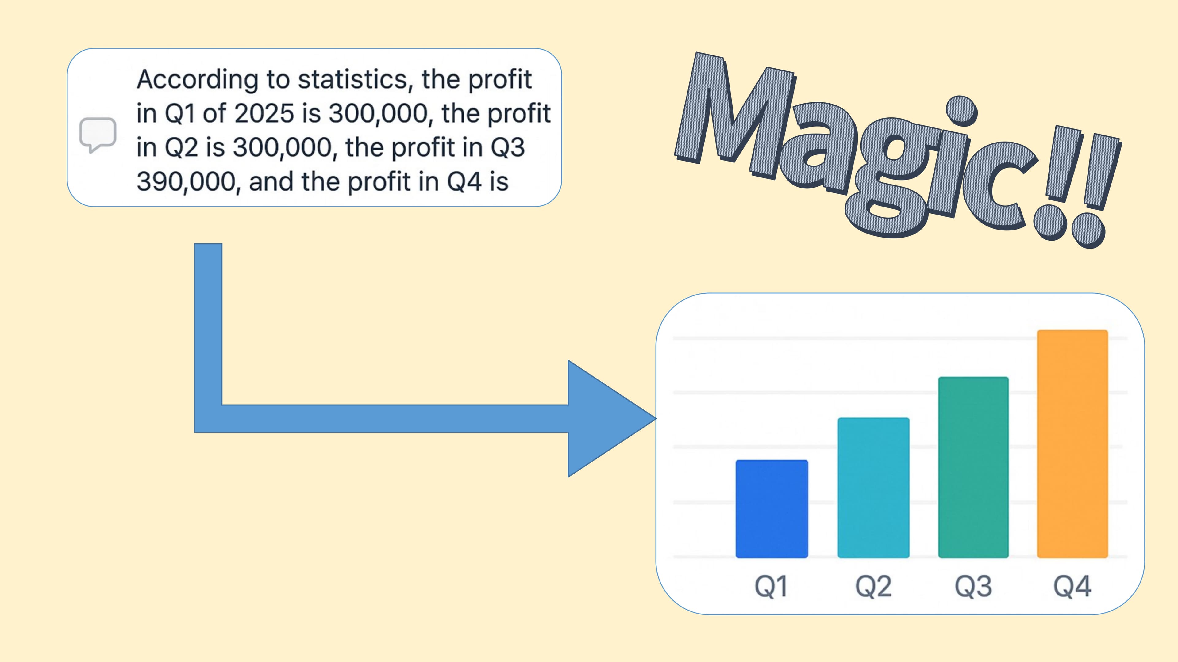
Watch AI Work Its Magic
Our smart pie chart maker understands your data and creates a beautiful, professional chart instantly
Customize to Perfection
Adjust colors, labels, and styling to match your needs. See changes happen in real-time as you edit
Download & Share
Export your finished pie chart graph in high-quality formats ready for presentations or reports
When You Need to Make a Pie Chart, We Make It Simple
Pie charts turn complex data into clear visual stories. Whether you're showing budget breakdowns, survey results, or market shares, our pie chart maker helps you create compelling visuals that everyone can understand.
What Makes Pie Charts So Effective?
Pie charts instantly show how your data pieces fit together. Each slice represents a portion of your total, making it easy to spot the biggest contributors and understand proportions at a glance. Perfect for presentations where you need to tell a clear data story.
Why Choose Our Pie Chart Graph Maker:
- Smart Design: AI automatically picks colors and layouts that look professional
- Accurate Math: Percentages calculated automatically - no spreadsheet needed
- Instant Results: Describe your data in plain English and get beautiful charts
- Ready to Use: Export for presentations, reports, or social media
Perfect Times to Make a Pie Chart
✅ Great For:
- • Budget breakdowns and expense tracking
- • Survey responses and poll results
- • Market share and competitive analysis
- • Time allocation and resource planning
💡 Pro Tips:
- • Keep it to 5-7 categories for clarity
- • Use contrasting colors for easy reading
- • Include percentages for precise data
- • Consider donut charts for modern look
Smart AI Assistant
Our pie chart maker understands your data context and suggests the best visual approach for maximum impact and clarity.
Everything You Need to Make a Pie Chart That Stands Out
Our pie chart graph maker combines simplicity with powerful features. Create professional-looking pie charts without any design experience - just focus on your data, we'll handle the rest.
Smart Percentage Calculator
Never worry about math again - our pie chart maker automatically calculates percentages and updates them as you edit your data.
Live Editing Experience
See your pie chart graph update instantly as you type. Edit data, adjust colors, and customize labels with real-time preview.
Professional Export Options
Download your finished pie charts in crisp PNG, scalable SVG, or print-ready PDF formats - perfect for any use case.
Customizable Display
Control every aspect of your pie chart appearance - show or hide labels, percentages, legends, and choose from modern color schemes.
When to Use Our Pie Chart Graph Maker
See how professionals across industries use our pie chart maker to turn complex data into clear, compelling visuals that drive decisions and engage audiences.
Business Reports & Analytics
Make a pie chart to show market share, customer segments, or team performance. Perfect for executive presentations and quarterly reviews.
Budget & Financial Planning
Visualize spending patterns, investment allocations, and financial breakdowns. Our pie chart maker turns numbers into clear insights.
Survey Results & Research
Transform survey responses into engaging pie chart graphs that highlight key findings and make data easy to understand.
Make a Pie Chart That Tells Your Story
Whether you're presenting to stakeholders, analyzing trends, or teaching concepts, our pie chart graph maker helps you create visuals that make your data memorable and actionable.
Popular Use Cases:
Success Stories
Marketing Teams
Show campaign performance and budget allocation with clear, professional pie charts
Sales Managers
Visualize territory performance and lead sources for better decision-making
Educators
Create engaging visuals for student surveys and academic performance data
Non-Profits
Display donation sources and program impact for transparent reporting
Everything You Need to Know About Our Pie Chart Maker
Get quick answers to the most common questions about making pie charts with our tool. From basic usage to advanced features, we've got you covered.
Making a pie chart is incredibly simple! Just describe your data in plain English (like 'Sales by region: North 40%, South 30%, East 20%, West 10%') and our AI-powered pie chart maker instantly creates a professional visualization. You can then customize colors, labels, and styling to match your needs.
Yes! Our basic pie chart maker is completely free to use. Create unlimited pie charts, customize designs, and export in standard formats without any cost. We also offer premium features for advanced customization and higher resolution exports for professional presentations.
Pie charts work best when you want to show parts of a whole - like budget breakdowns, survey results, market share, or time allocation. Your data should add up to 100% and ideally have 5-7 categories or fewer for the clearest visual impact. Perfect for showing 'what percentage of my total does each category represent?'
Absolutely! Our pie chart graph maker offers extensive customization. Change colors to match your brand, adjust labels and percentages, switch between 2D and 3D styles, create donut chart variations, and control which elements appear on your chart. All changes happen in real-time so you can see exactly how your chart will look.
You can export your finished pie charts in multiple professional formats: PNG for web use and presentations, SVG for scalable graphics that look crisp at any size, and PDF for print-ready documents. All exports maintain high quality and professional appearance.
Not at all! That's the beauty of our pie chart maker - it's designed for everyone. Our AI handles the design work, automatically choosing professional colors, optimal layouts, and clear labeling. You just focus on your data, and we make it look great. Perfect for business professionals, students, and anyone who needs quick, professional results.